Creating a Web Map Application Using ArcGIS Online WebApp Builder - Brief Introduction
Having access to ArcGIS Online allows you to create and design with an almost endless set of tools. Today I want to try to get some those tools some grounding and give you an example of an excellent way you can use some of their assisted design tools to create powerful interactive applications. So the tool we are going to look at is WebApp Builder, which is a tool that you can insert a web map that you have created previously and use the WebApp Builder widgets and other tools to amplify the narratives that your web map was attempting to tell.
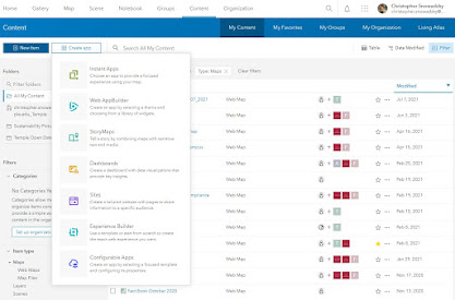
So to start you are going to first go to your content page and create a app and select WebApp Builder. See picture below:
Once you create a new web app, give it an appropriate name, summary, and some relevant tags. Once you do that you will then see the various themes that are going to be available to you. Take some time to explore these themes. These themes modify the location of the widgets, search bar, legend, and other various elements to your map so it is important to understand what you want your final goal to look like, it is important to note that this is nothing final and you can always go back and change the theme but will have to reconfigure all of the widgets that you would like to have included. Image below shows the page you should see. For our example going forward we are going to look at the dashboard theme as it allows you to mess with various widgets that I would like to cover to help support the narrative your web map aims to tell. When you select dashboard layout you should see the button in the top right like in the screenshot below titled "modify layout". We are going to modify the layout so we are only seeing two widget boxes to left of our map view, these two widgets will be our workspace for the tools we plan to add.

After you mess with the layout, its time to add your map to the application. Click the "Map" button on the top left by "Theme" to add the map of your choice. Once you select the map, we are able to start adding widgets to the application to create new visualizations. I will cover a couple of the widgets you are able to add and will go through how to add a dynamic infographic that changes as the data within your window view changes.
As you can see, there are various slots for you to insert widgets around your map view. Two are on the left which I would recommend you use as your widget section for the legend/layer selection grouped in widget 1 and the dynamic infographic that we construct in widget section 2. The 5 widget slots that you see on the bottom represent the widget spots in the top left of your map view, these are interactive buttons that the user must click on to interact with. These typically are the home buttons, about sections, printing, or other analysis tools that are available. The widgets in-between the two open slot sections are widgets that do not take up slots on your application and are additives that are built in every theme you explore on the WebApp Builder. I have found that a majority of these are useful to have but it gives you the flexibility to create the application for the userbase. For example if you are creating an application for an applications private use you may add the attribute table widget to allow your users to export the data they are seeing on their screen. However if you wanted to construct an application for the public eye, you may want to keep the attention of the user to be a viewing experience rather than to create their own analysis as it could be private information. It is super important to keep the look and user experience up to par with what the intention of the application is.
So lets jump to creating an dynamic infographic that updates the data as the user zooms in and out. They have made it pretty simple to do so, first add an infographic to the widget 2 slot on the left sidebar. To do so click on the 2 on the top left of the sidebar, as you can see there are 20+ different widgets you can host in these slots but for this walkthrough we will select infographic. You should get this screen.

I think the best visual for this example is a pie chart, but it is possible to apply the dynamic affect to these graphics. Select the pie chart infographic which will give a list of features available on the map you selected that can be used for this graphic. For my example, I will be using the land use surface layer that tracks the different kind of surfaces on the campus as well as the area that they occupy. It is essential to note that for these graphics to work it is similar to excel and any other graphing software, you will need to have a layer that contains at least one column with numerical value. Once you select the layer, this screen should pop up. Below are the two general windows you will see a data window and a text window.
 |
| Data Window |
 |
| Text Window |
The text window serves as your place to modify the text of anything you would like in your graphic both above and below. You are able to turn these off by selecting which window you'd like to hide out of the three shown to the top left of the template window ("Title of the inforgraphic"). The data window is where you manipulate the data you would like to be shown on the pie graph, as well as the display of your graphic. In the data window, you get to choose how you would like to display the data and then select which category (field) you would like to show as well as how that data is calculated statistically. For my example, I chose to select for my display section "Display values by category". Most of it is self explanatory on the display side, it is the space you can add labels and a legend to your graphic. You can also change the colors of the graph and for them to even match the layers symbology on your map! Once you have your elements full customized you should arrive at a nice looking pie chart that informs the users instantly some quick statistics of what is on their screen. Here is the graphic combined with some other widgets that you are able to add in the various widget locations.

As you zoom to new locations on the map you will see that the graph adapts to what is on your screen.
You can hover over the category whos value you are interested in and will show that as well as highlight all of the interested category on your map view. This is a very helpful tool to help you really see the change of quantities as you change the area you are looking at. That is the gist of creating an application on ArcGIS Online using WebApp Builder, the final step is just ensuring it has the proper sharing privileges for your audience and you are good to send the link out or embedded it on your own website!


Comments
Post a Comment